Thursday, 22 January 2015

COLE & SON 'SQUIGGLE' WALLPAPER


I'm referring you back to a previous post above because yesterday my beautiful wallpaper at last went up in my Bedroom.

And I have to tell you that it looks wonderful; I am so happy with it. Just a touch has zoned the bed off and I feel like Alice in Wonderland, seeing everything through new eyes.

The wallpaper I refer to is the fabulous 'Squiggle' by Vivienne Westwood for Cole & Son. 
I chose this wallpaper to add an edge to the florals I have used for curtains and blind trimmed with Sanderson beaded trim. I have always loved Navy and so I have stuck to variations of this against a neutral palette, with flashes of turquoise in accessories.

Look back at my previous post to see how I put my bedroom scheme together. 

I now have the enviable task of searching for the right bedspread to do this paper justice and when I have found it and the room is styled to perfection (give me some time) I will show you the results.


Sanderson beaded trim
Squiggles dancing behind our bed

particularly pleased with how these little reading lights look

Clarke and Clarke curtains


Happy with this combination


This is a good example of how the same paint colour can be
influenced by what is around it


I'm afraid that this gorgeous William Yeoward fabric (blind) is no longer available from Designers Guild.

There are, however, some beautiful alternatives if you have the time to look.


Sweet dreams.

Sunday, 18 January 2015

IMAGERY


Had a bit of fun today using PicCOLLAGE for the first time - anything to feed my visual addiction (and obviously I need plenty of practice!) 

Good fun for putting things together as a reminder. My home is finally coming together (using photos taken on my Samsung Notebook).


As of last week I am the proud owner of a beautiful Nikon D3200. 
There was so much research involved, helped along by Fro Knows Photo reviews. 
I wanted to progress from using my phone, though this does take great photos.

I've been taking some practice shots around the house today and I am really pleased with the quality already:


  http://www.gorenje.co.uk/products/cooling/models/freestanding-fridge-freezers/471869

 
Zoffany's Lotus Flower fabric

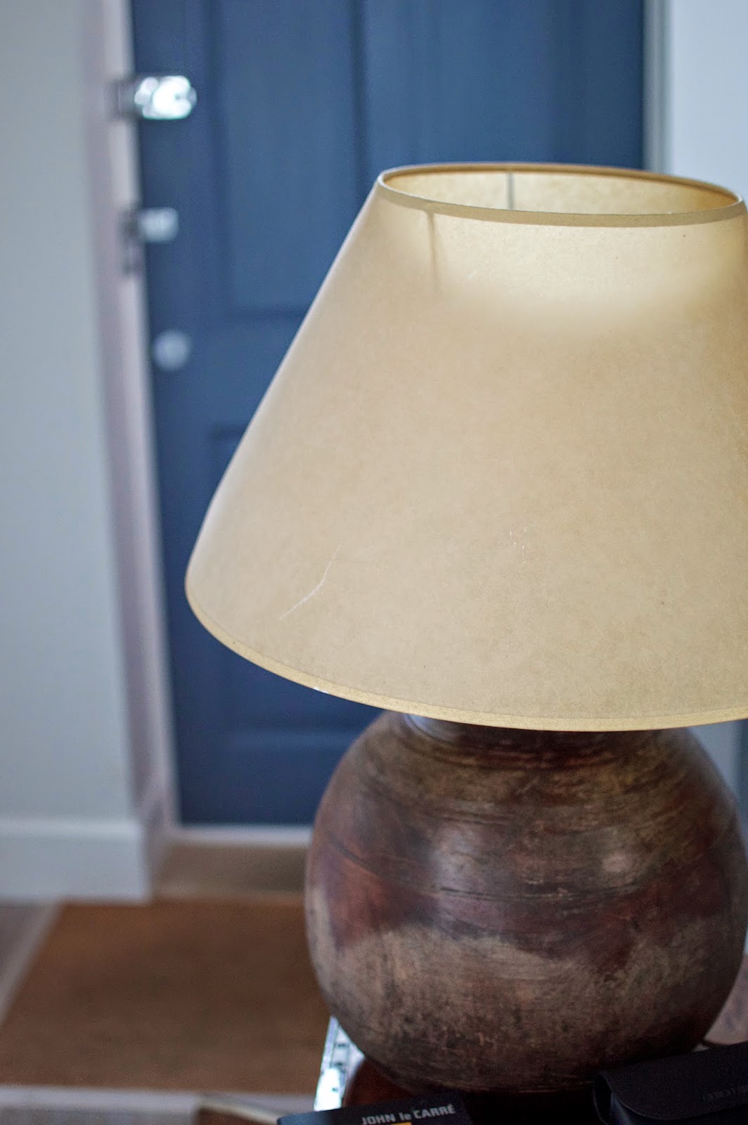
Little Greene Paint Company's
Juniper Ash

looks true to colour in this.

 These are all taken with flash forced off, and as RAW images and are better than I expected for starter photos.
I am most impressed by the colour which is exactly in the photo as in the flesh.
I have also used a 35mm 1.8 lens as recommended by Fro so that I get used to taking good photos without the use of a zoom - ie. up close and personal.
I think my new camera might just be my new best friend.


Wednesday, 14 January 2015

HOUSE SIGNS

House sign in slate with concealed fixings courtesy of www.buysigns.co.uk

House signs are tricky to choose. There's always that niggling worry: "What does this say about my home and therefore about me?"

Well I just took the plunge and my sign arrived this morning.

I love it in all it's beautiful simplicity: clean, clear and to the point.

It will look crisp against the brick porch and most importantly save visitors driving up and down the road and up and down again...and again.

The house name is, however, now purely ironic, as we have no chimneys (well not originals anyhow). All that's left is the log burner chimney.. 

Wednesday, 31 December 2014

Thoughts before New Year - COLOUR

Before it is officially 2015 I must tell you about the talk I went to at Decorex given by Colour Trend Consultant for Global Colour: Sally Davies. (I hinted at it briefly in my Decorex 2014 round-up).

Sally comprehensively and engagingly ran through the key themes for Autumn and Winter 2015/2016, accompanied by beautiful explanatory slides. 

You can get a sense of these from the pictures below though I apologise for the quality:


There are 32 colours forecast for Autumn Winter 2015/16. 

PREVALENT COLOURS:

ORANGES - RUSTY & NATURAL
GREENS - COMFORTING AND QUALITY
BLUES - NATURAL AND SOFT


TREND DRIVERS: 
  • Future Energy Supplies
  • No boundaries (merging of domestic and public spaces for example home offices)
  • Nature taking over

SPECIFIC TRENDS:
  • Remote
  • Sonic
  • Fuse
  • Sense
  • Mix of fibres
  • Distressed finishes
  • Flat textures (possible through modern technology)
  • Craft but sophisticated
  • Foraged finds

INFLUENCES:

Remote
Solitude
Handmade & homemade
SLATE ESSENTIAL LAPDESK - ETSY
Craft (eg. Etsy)
Natural world
Rural
Comfort but quality
Earthy tones
Chalky and rustic
Pinks


Sonic
HIVE - ATELIER OÏ 
Synesthesia
Bright and energetic
Musical instruments
Lithograph 1960s
Block colours
No white   
Vibrant yellow  
Punctuated by accent
Dual tones - complementary
Cut out designs
Formica
Playful with colour


FRANCO LAMP - HABITAT
Mechanical
Workshop aesthetic  
Nothing to hide
Domestic / Industrial
Retro browns
Earthier reds
Cyan


CLOCK - ALLAN YOUNG
Metals
IPOD NANO
Anodised  
Synthetic / Natural
Ageing metals
Recycling but considered and luxe
Industrially driven but refined (best bits used)


Senses
Interaction - engage  
WOOD ESPRESSO MAKER - Oystein Helle Husby
Story
Made of what?
Hard and soft merged
Invite you to engage and look more closely
Adventurous with mixing of colours
Sweet and sinister = interesting
Dirtier pastels (not childlike)
Purple


Textiles
Embossed (subtle)
Spherical
FRINGING TREND


Fringing  
Unusual colours
Engage and touch
Uplifting


GREYS are still in

 If you really get a kick out of colour then do have a look at Mix Magazine 

HAVE A GREAT NEW YEAR!


Tuesday, 25 November 2014

RAINY DAYS...

DARK AND RAINY DAYS

Currently I have a strange fixation with all things warms and cosy - a tonic whilst the days are short, dark and rainy. My love of the month is the Saarinen Womb Chair. I just want to curl up in it, with a blanket granny-style over my knees, by a fire, with a book... is this too much to ask? (Oh and maybe a hot chocolate on the side?)


Monday, 10 November 2014

DECOREX 2014 - PART 2

FERMOIE

I do apologise for the delay in finishing my Decorex round-up for 2014 but I have had flu.. miserable.. and lost 2/3 weeks of my life which I'm busily catching up on..

It's been a while, but I'll just hop in my time machine and head on back........

At Decorex this year I officially found my 

Favourite Fabric of 2014.

I smiled - a lot - when I saw it, in this beautiful screen form, outside 

DANDYLION DESIGNS

I am ashamed to say that I had never come across this gorgeous company, since it was not one we dealt with at my previous place of work.

So, having gazed at this perky floral in all it's cheeky citrusy gorgeousness, I stepped inside. It is most certainly a fabric to dwell on over the coming darker months.

Many thanks to Jessica Fell, Creative Director, for telling me all about Dandylion.

For those of you who don't know, this company is based in Lancashire where the fabrics are also milled.

Certainly one that I will be keeping an eye on in the future.


OFFICIALLY MY FAVOURITE FABRIC OF 2014

More fabulous DANDYLION fabrics:


all from the VERVE COLLECTION.


CUTE ADVERTISING

Dandylion designs has lots of other goodies on its website so do have a look!

*********************************************************************************  


Last time I blogged, I mentioned the wonderful Copper & Silk.

This week I must mention another fabulous lighting company, whose lighting was also spotted at Chelsea Harbour in the Zoffany window display a few weeks' before:

CURIOUSA & CURIOUSA


Here is Esther Patterson, the founder of this Derby-based company, which is committed to working with UK based craftspeople and suppliers. 

Truly covetable lighting.

Thursday, 16 October 2014

EMMA @ DECOREX 2014 - part one


OK so Decorex has been and gone. However, I did make it, just, by the skin of my teeth; so here is my delayed contribution, for what it's worth.
I have to say that, having been disappointed by last year's venue, I  loved this year's 
SYON PARK.
Access was made easy via a pretty slick arrangement of bus collections (mine from Richmond Station). 

Clipboard huggers were positioned at great vantage points to direct and everyone was smiling. The bus was awash with chatter and I sat next to an author so the trip went quickly whilst we nattered. All good so far.

Rain hadn't dampened spirits on arrival at the tents. There was a lovely feeling of arriving at a party which I adored because it built excitement.


And inside didn't disappoint either, with plenty of places (albeit pricey)to rest your brain and feet and pick up a coffee/snack/meal/champagne.

And, with a coffee or two inside me off I went up and down the grids, stopping only when something gorgeous caught my eye...
which it did:


COPPER & SILK
Love these dip-dye lampshades.
Glorious colours against the  Copper & Silk Stand.


Designing in a time of Covid

Well it's 2021 We should feel refreshed after the Christmas 'break' - right? Hmm Acceptance Yes you saw right - acceptance This ...